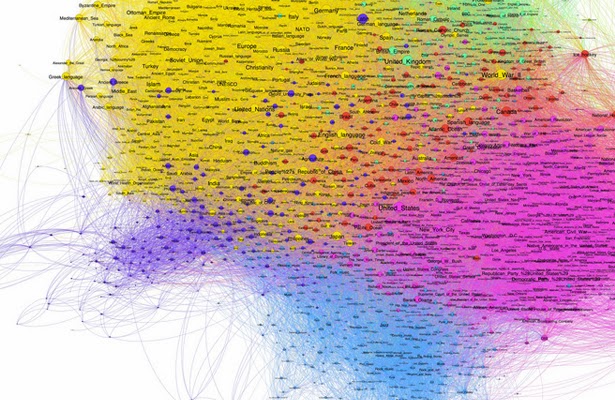
Big Data visualization can be big enough to show executives big picture but needs to be nimble enough to stay focus.
Data Visualization will change how you think about the world.
Right now there is a significant knowledge gap between having the data,
interpreting it, and finally being about to visualize it. It demands multiple skill
sets which are rarely present in most of the analytics team. So what is the focal point for data visualization, and how to make it effective?
Visualization is the
best way to really understand Big Data. It was hard enough with
smaller data sets to get a real grasp on the meaning of data without
visualization. You have to be able to interpret and draw a conclusion based on
what you are seeing and that often comes down to being taught how to interpret
what you are seeing. You can only combine these two things if you know what you
are looking for. Visualization data
is the best way to present information because it is in people nature to receive
visual information. It is very perspective to develop visualization methods which can leverage multi-factors in discovering 'big signals.'
The ability to
combine art and science is like finding a world-class champ, the general
principle in understanding anything is to perceive with as many senses as
possible. Being able to hear it and seeing it would give a much deeper
understanding and data visualization goes a long way in improving human
understanding of big data. While data visualization is important for understanding,
it’s governed by personnel needs, likes, and interpretation. For example, some people are able to interpret the data well
when it’s a bar chart, some will like to have a line chart. The intelligence of the
system to highlight deviations and create meaning for the forecast is the need
what all business is looking at.
'Lightweight’ Visualization to draw meaningful Insight out of it. Although visualization might not be
a new term and for years businesses have been building a presentation layer of
dashboards, widgets, etc... the focus is now on building analytics and platforms
that allow users to discover value in some piece of information that's
available in its raw form and be able to draw meaningful insight out of it,
rather than a design/schema heavy approach where one had to ask a question
first to look at how the information can be visualized. One of the great
challenges of broader acceptance of richer data visualization experiences will
be robust filtering or distilling of irrelevant data or content. In a lot of cases, many data visualization tools immediately lose the audience because
they are trying to over process and visualize "big data"
repositories. It's the old problem of "fire hosing" a customer with
too much information. Visualization can make this worst. Some of the best uses
of visualization have been simple, small and targeted visualizations of
customer problems.
There is definitely a
balance (of complex data and simple solution) that needs to be found--it has to be understandable given the
complexity of most multi-dimensional information, yet simple enough that people
will actually find meaning from it--and maybe even more importantly, find the
tool usable! IT may talk a lot about on-time and under-budget, but that becomes
meaningless if no one uses the tool--usability has to be a factor that is
considered. The key is that a visualization is an important approach to
communicating insight. But it has always been thus, visualization is not a new
tool in businesses or life. Data visualization has changed how we think about
the world; it's been doing so for longer than software vendors have existed. Even
industry leaders with their legacy Bread & Butter products find
visualization area enticing. Looking forward to the smooth and seamless
integration of these data visualization products to the mainstream products
and also solve the new buzzing Big Data puzzle
 Visualization is
often one of the best ways to convey big and small data, contextually. The
ideal visualization is one that enables decision-makers to see a high-level
view of the data and then be able to drill down to different sublevels. Visualization
is often one of the best ways to convey big and small data, contextually, that
helps to explain and portray one or more outcomes. It's not the only way to
present Big Data, it's not about a list of products either (although they do
help). It's a function of good design and analysis. Visualization software
needs to be able to throw up data often with the ability to go down to the last
minute detail. A number on a graph often needs to explode right down into the
details of every record. That's what Big Data is asking of Visualization
software now.
Visualization is important, but visualization is just the
start of exploring Big Data. Companies need to move beyond visualization to
Visual Analytics to truly gain insights into their Big Data. Big Data visualization can be big enough to show executives big picture but needs to be nimble enough to stay focus. Visualization is no doubt the best way
to get the understanding of the data, but
it should be used in coordination with effective Analytics to present the contextual picture of the data.


4 comments:
The Oracle Data Lake Store (ODLS) is a file-based data lake that allows users to access, analyze and process data of any size or type with a single interface. It also allows secure coexistence of traditional RDBMS systems with unstructured data managed in theOracle Data Lake Storehelping organizations to leverage the potential of both structured and unstructured data. This means that data-driven applications (both big data and business intelligence) across the enterprise can access data at any point in the data lifecycle, in any form, at massive scale, and with low latency.
Thank you for sharing such a piece of wonderful information. I found so many interesting stuff in your blog. You can also take some great ideas from Data Virtualization.
Post a Comment